
YOU GUYS! I DID IT! COMPLETED OUR FIRST 6-WEEK BETTER HOMES AND GARDENS ONE ROOM CHALLENGE!
This post focuses on the major design elements and sources only. Click HERE to be taken directly to the full Source List for this Guest Bedroom, with links to all the details, paint colors, etc.!
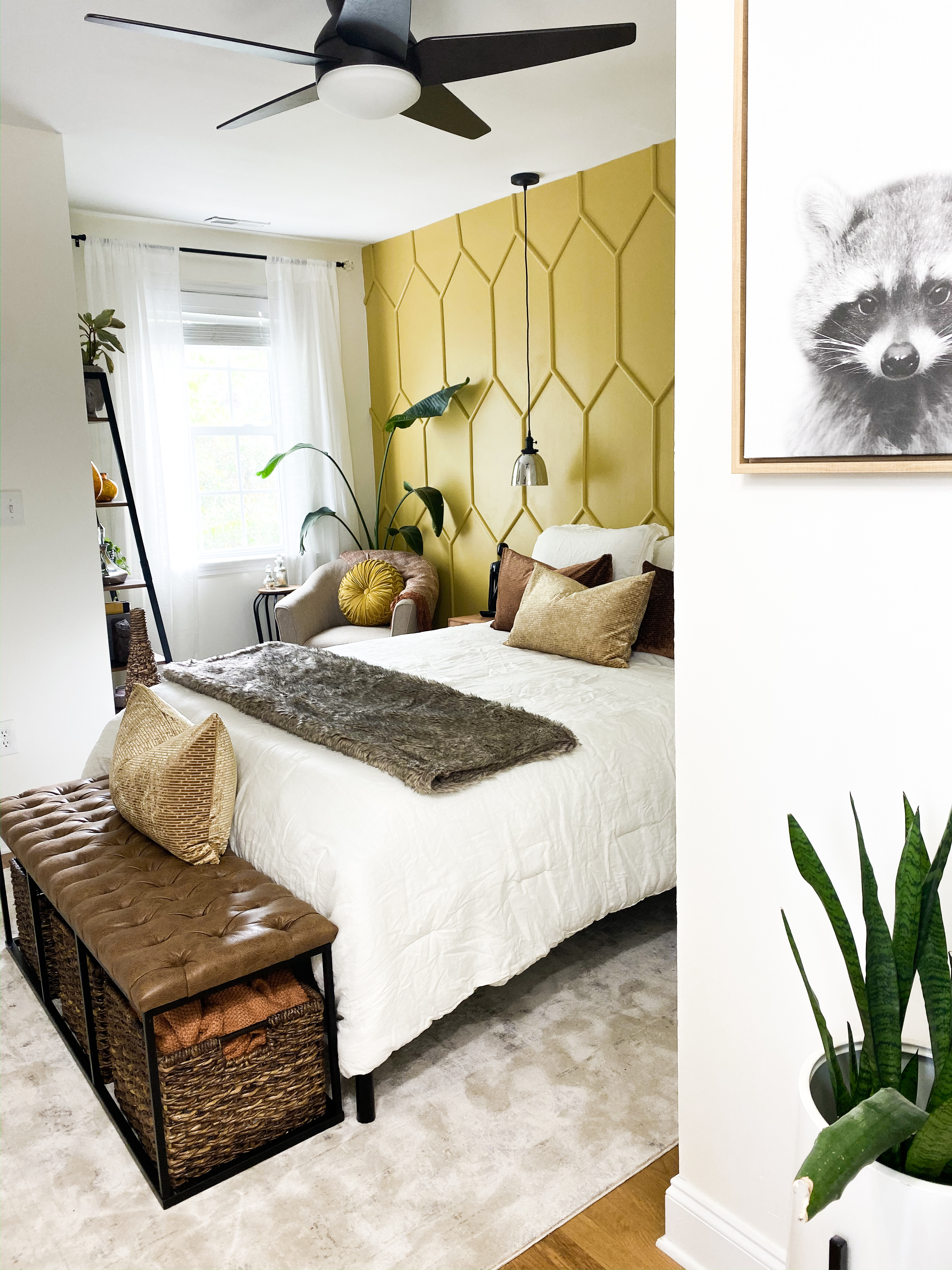
Side note – if you know me, you know how much I LOVE RACOONS! This monochrome racoon print is at the entryway to this room, and it doesn’t reallly go with the rest of the room perfectly, but its the first thing you see when you get to the top of the stairs so I have it there for the joy it gives me everytime I go up the stairs. If the decor in your home doesn’t make you smile, then you’re doing it wrong!
Well, it sure was a whirlwind! We recently moved into our next new-to-us (over 100 year-old) house in downtown historic Charleston, SC a few blocks from our first flip. We’ve been focusing on making areas “livable” and ignored the guest bedroom for quite a whole after we threw a bed and a rug in there so it would at least be a place for famly to sleep.
With the holidays coming up, I really wanted to make this room somewhere I’d be proud to put up family and friends, and the 6-weeek challenge seemed like a great way to kick my butt into gear! We did a 6-week challenge in the spring to completely gut and renovate a guest bathroom that had some serious plumbing and mold issues that make it completely unusable. That what quite the project – and I was really excited that this guest bedroom only needed a facelift instead of a full gutting!
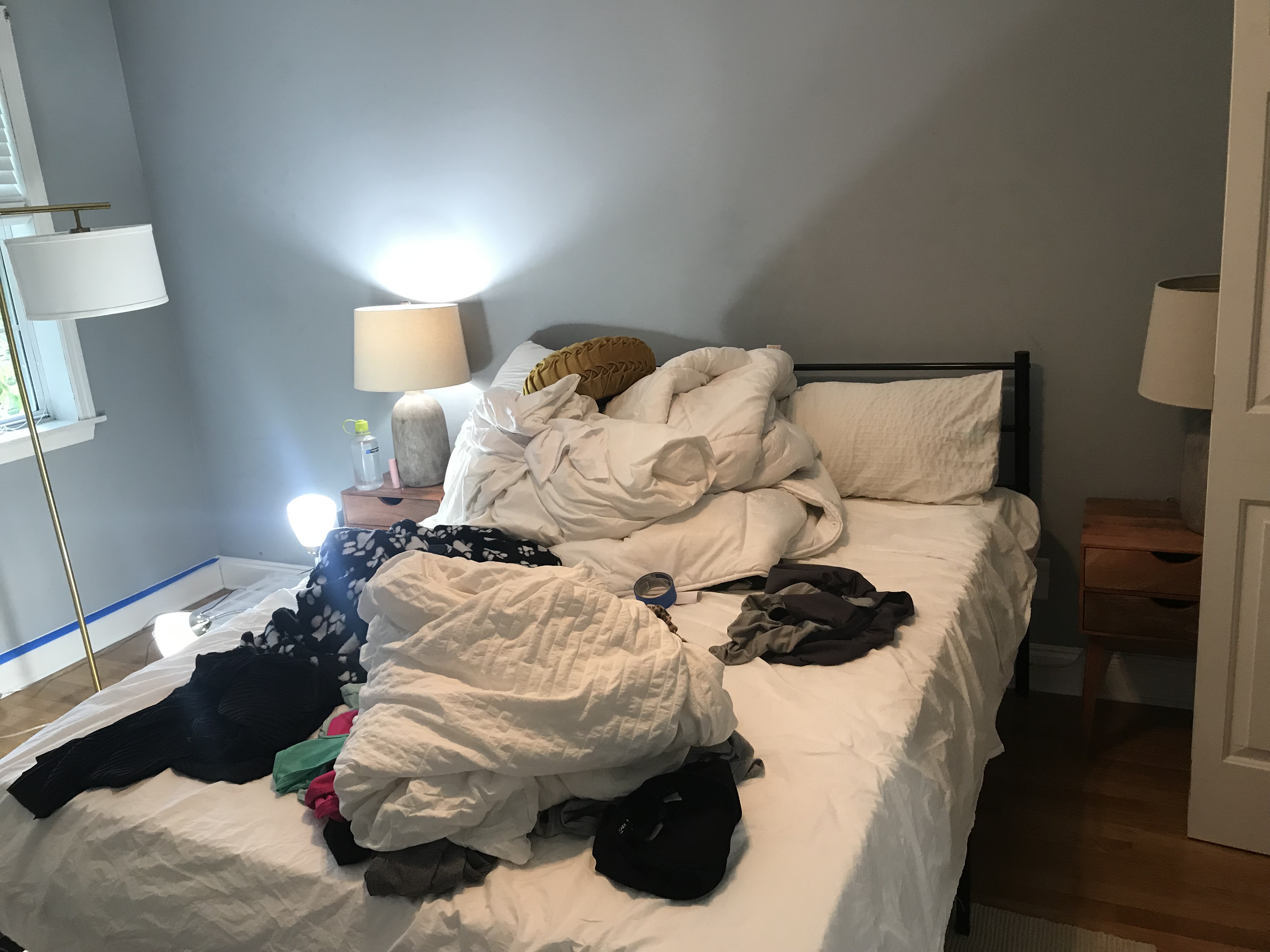
First lets have a quick reminder of the “before” – if you recall, we recently moved into this house and have been focusing on other areas and the guest room was completely ignored. Yes, this was the room with a bed – but the bed was mostly a place where we would throw clean laundry that we did not have time to fold. IT WAS LAUNDRY PERGATORY.
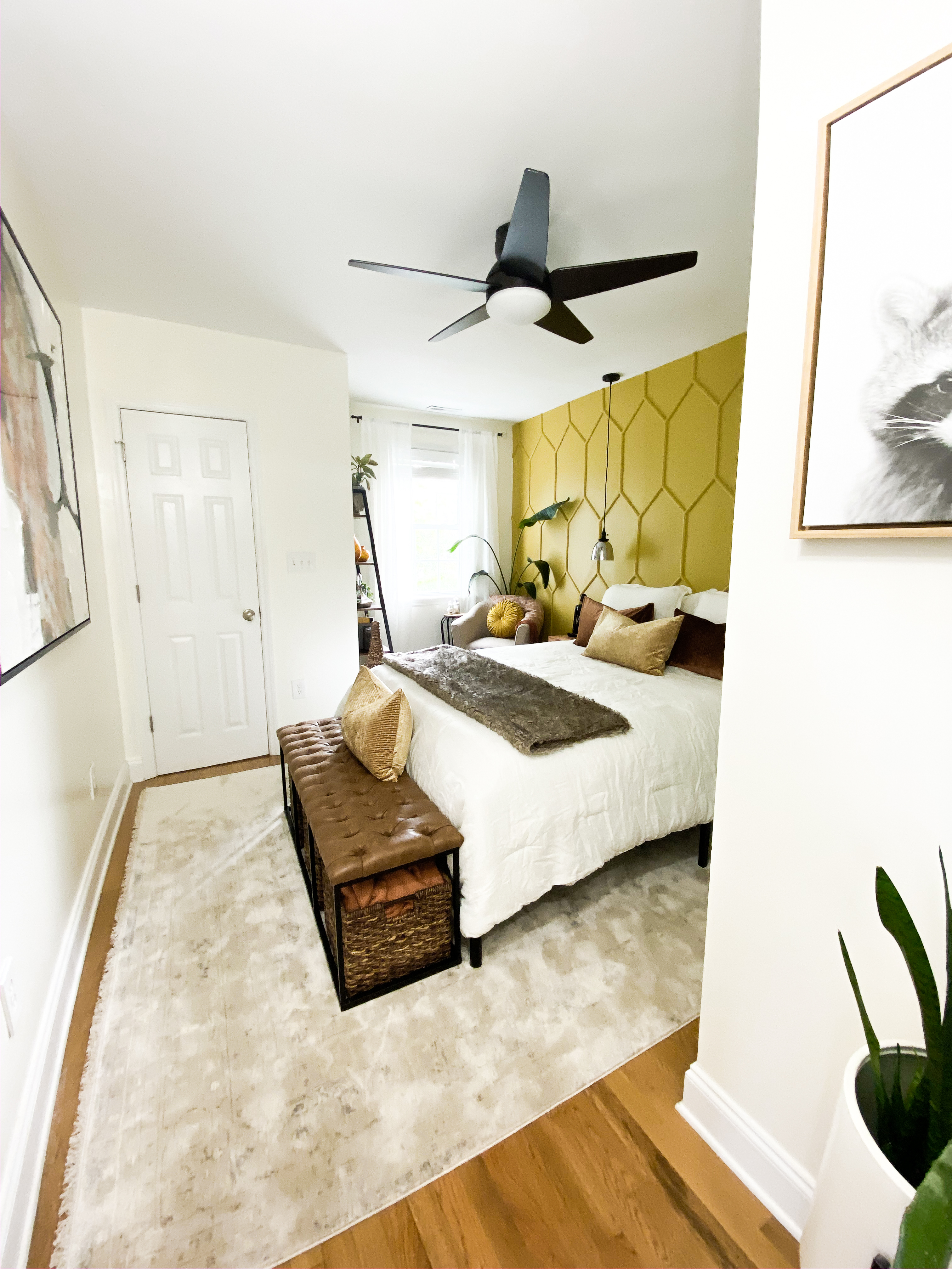
Since this room was only a facelift, and since it is a guest room that won’t be used every day or need to be super functional (I try to keep my guetsrooms minimal so they are always semi-clean and not full of crap), I really wanted to go outside of my comfort zone with the design. Normally, I am very bright, clean, white, a little maximalist boho, and a little modern french countryside. I wanted this room to be A TOTAL MOOD – I was thinking modern masculine sexy with a very warm flair. And I wanted to use a somewhat “non-conventional” color for the accent wall. I went to Egypt last month, and I think that played an inspirational role in this room’s design, as well. I am SO EXCITED WITH WHERE THIS ENDED UP and honestly, I surprised myself with how well my hexagon wall (which I’m not calling “The Hive”) turned out, and so happy with the room overall. It’s a small, weird shaped room that gets very little light, so that added to both the design and photography challenge.
I don’t know where to start – I love so much about this room! So, let’s go top to bottom!
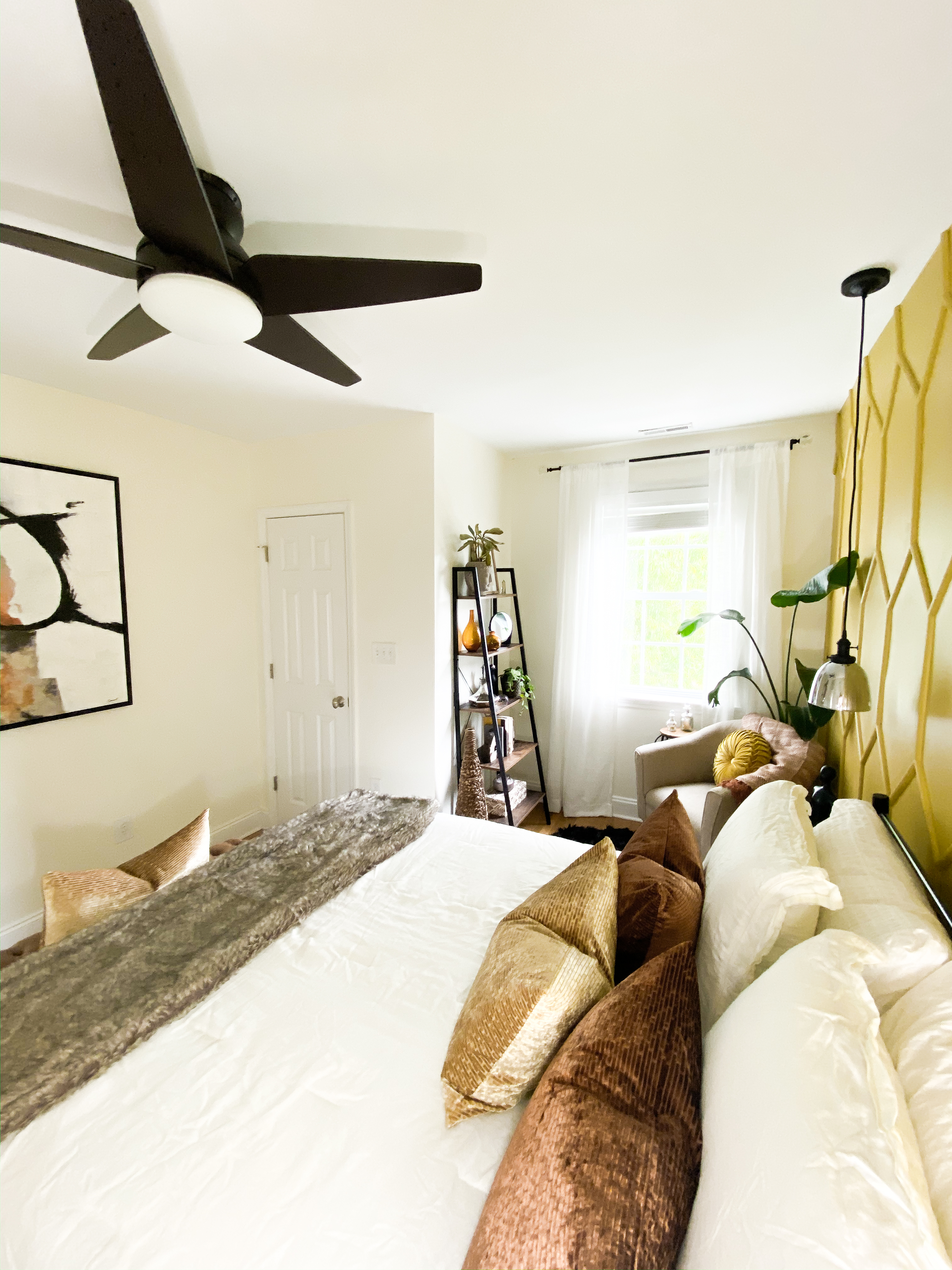
The fan is this STUNNING Casablanca Fan Company fan – it’s simple and modern, and the fan blades had this nice angular shape that echoed the intense angles from The Hive. It also comes with a reall great wall-mount control set. Side note – my husband installed these reall quickly, so, for you DIY-ers, this fan seems like a pretty easy and fast install! HOORAY! The fan is the Casablanca fans Isotope 52-inch fan (they also make a smaller 44-inch version) and both sizes come in a few different color combos – including an all white one, which I am eyeing for some other rooms in my house! I really love these Casablanca fans.
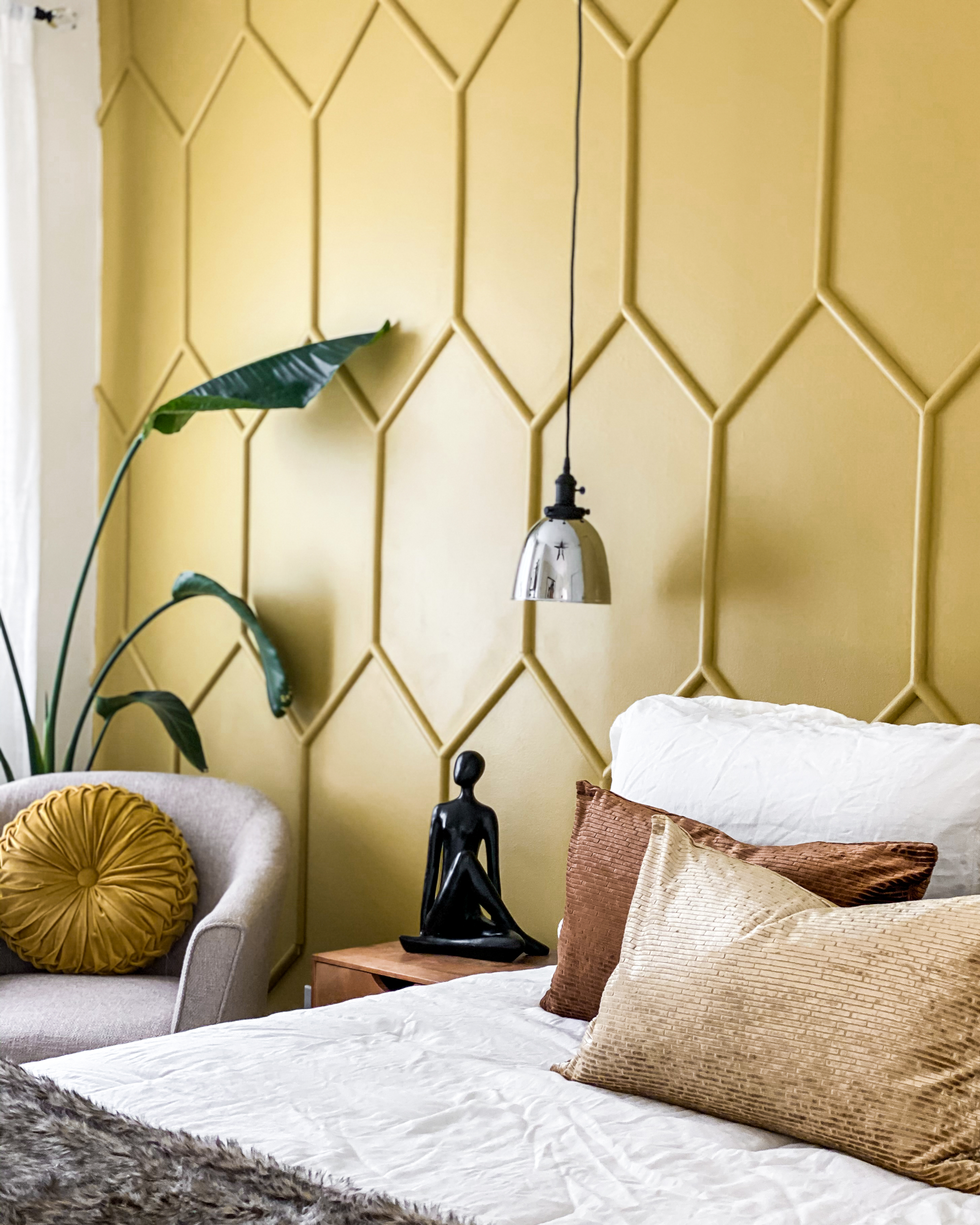
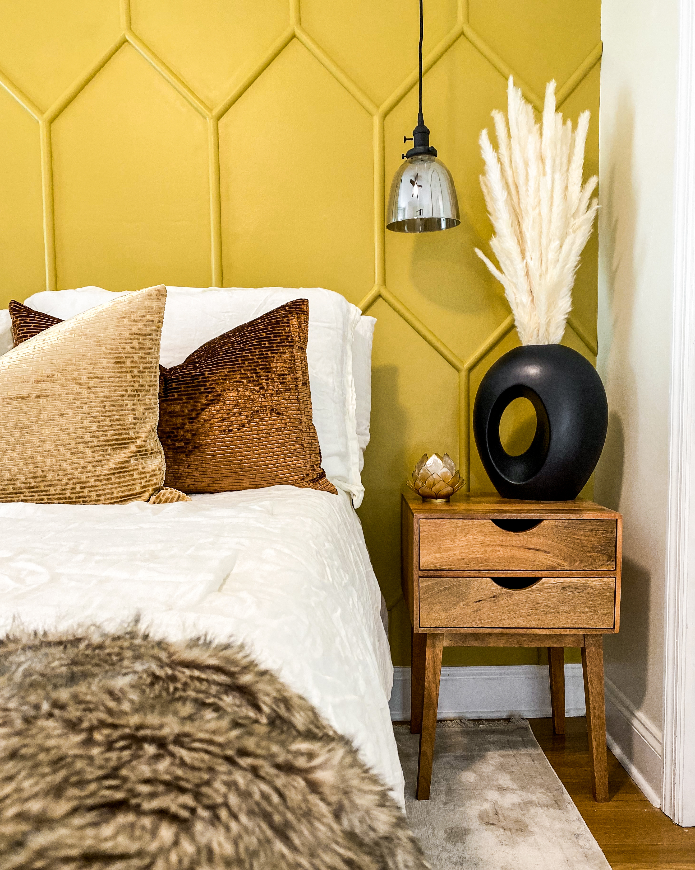
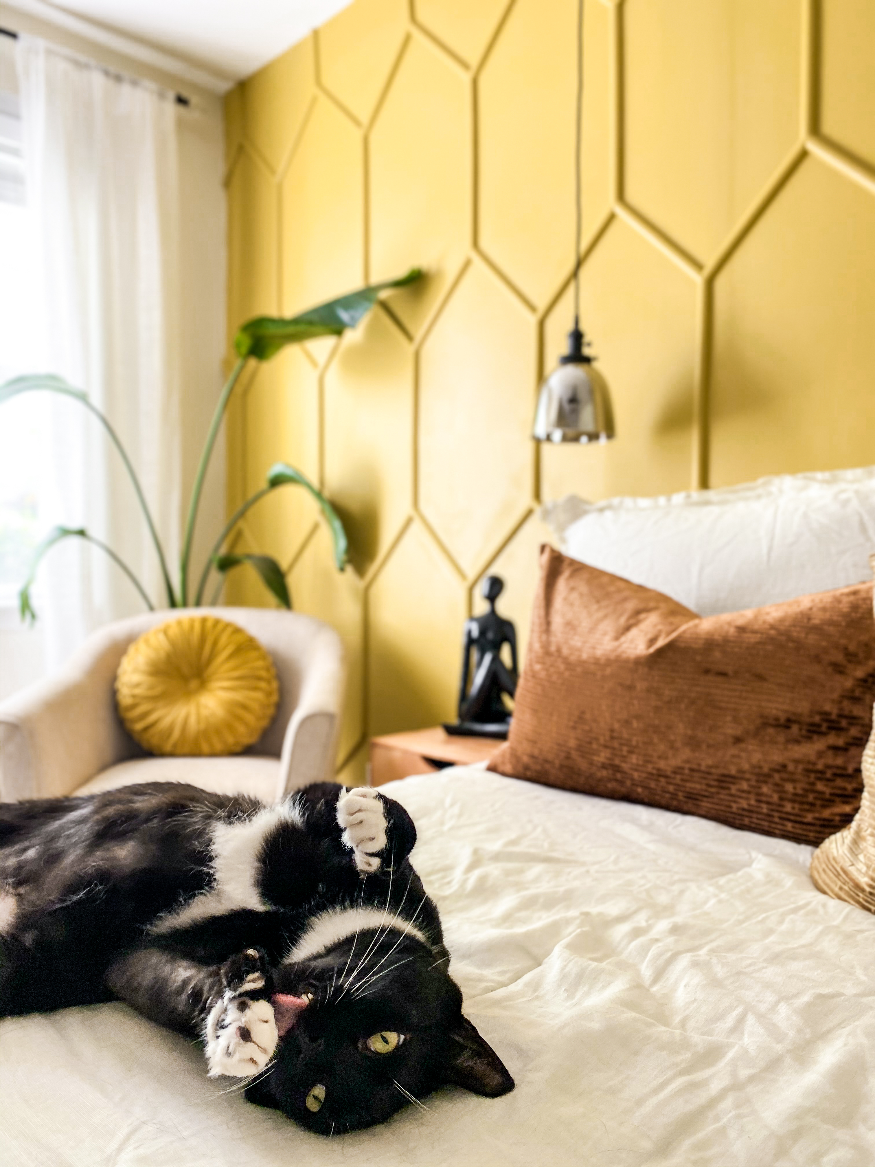
My hexagon accent wall is of course the feature of this room. It is a tiny room that does not get too much natural light. I wanted a feature area, but I was afraid a patterened wallpaper would be too much. And a plain accent wall (i.e., just a paint color) was not enough (for me, at least!) – so I decided I was going to do some detailed trim work and paint it all one color. And since this room is weird shape, the bed isn’t centered on the wall – so any “large” pattern or symmetrical pattern would not work with the bed becuase it would be off-center (yes, I know – who cares? Well, I care. I have an OCD issue with symmtery). So I had to pick a smaller pattern and “normal” shapes just were not cutting it for me! Once I got the hexagon shape idea I just couldn’t shake it, even though trim work is waaaaay more advanced than other shapes or designs. Sigh. I was determined to figure it out and make it work, and I’m SO GLAD I DID! I’M ABSOLUTELY IN LOVE WITH HOW IT TURNED OUT! (Stayed tuned on the blog – next week I’ll post a tutorial for the hex wall! Or, you can check the “Hex Wall” highlight on my Instagram page. There’s also a highlight showing the full One Room Challenge process for Fall 2019! (PS – in the next photo, look at where the wall meet the ceiling to see how insanely warped this wall is – that was quite a challenge when I was installing The Hive.)
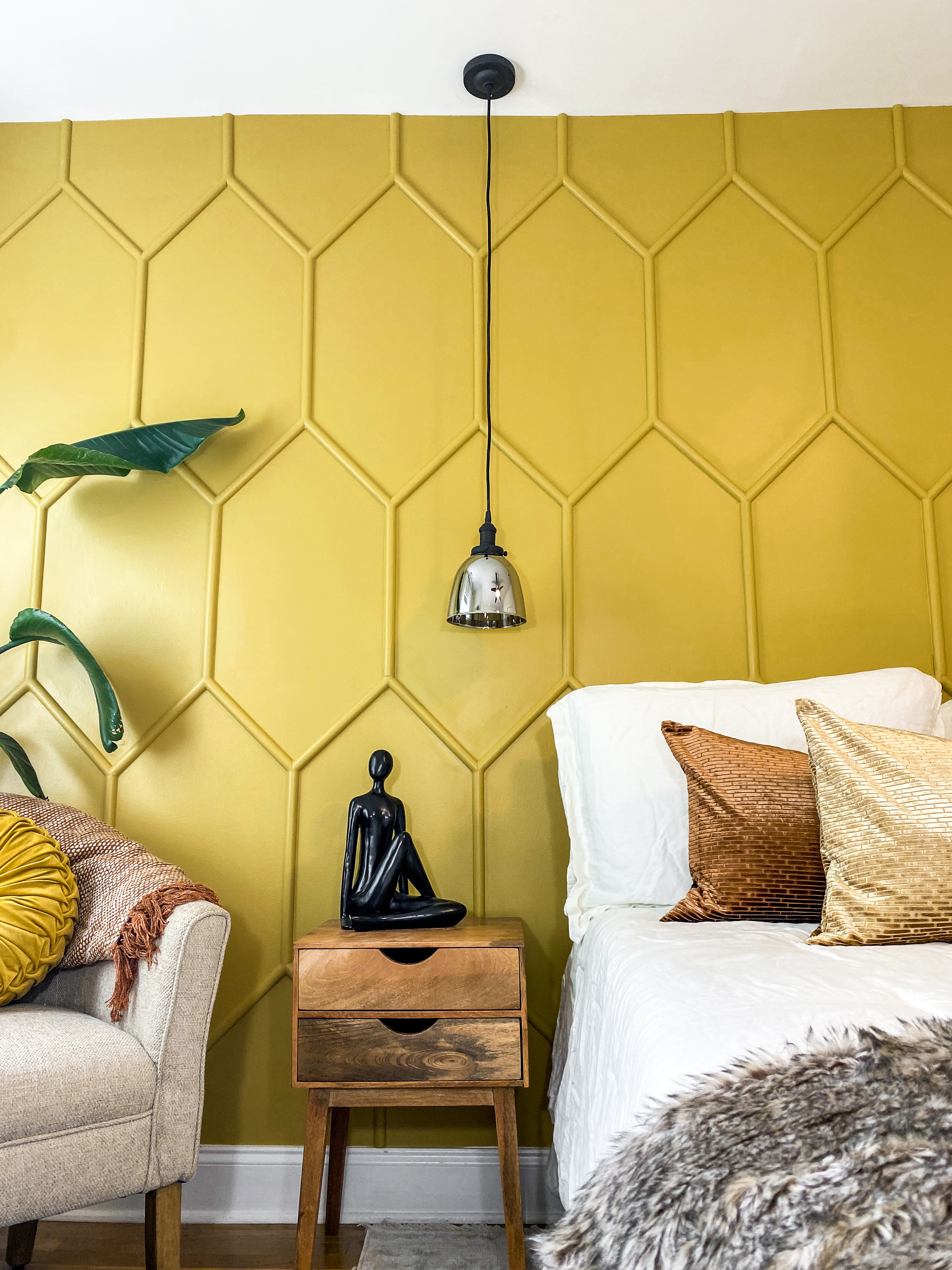
Let’s talk about the pendant lights! The room is very tiny and a weird shape – and so in order to have nightstands on both sides of the bed, they haved to be very tiny. That ruled out the possibility of having table lamps, especially considering I want my guests to have space for a glass of water, a book and thier phone). And, when it comes to design – there are a few things that I am super particular about… and one of them is symmtery and balance. Once I knew I was doing the hex wall (which I also chose for symmetry and balance reasons – the wall is perfectly symmetrial if flipped top to bottom or side to side (*pats self on back*)!), I knew it ruled out any wall-mounted sconces or smilar lights. So, this left me with pendant lights! To add to the complexity, it was important to me that my guests be able to switch the light on and of from the bed – so I had to find some sconces with switches, which are much more rare than you would think! And, I wanted these lights to be a big part of the **mood** for this room, so I wanted a slightly mirrored smoky glass. Finally, I needed the metal and wire to be black. So, lets just say it was a tall order! It took me a while to find them, but I finally found the exact lights of my dreams – FOR UNDER $50 EACH ON AMAZON PRIME!
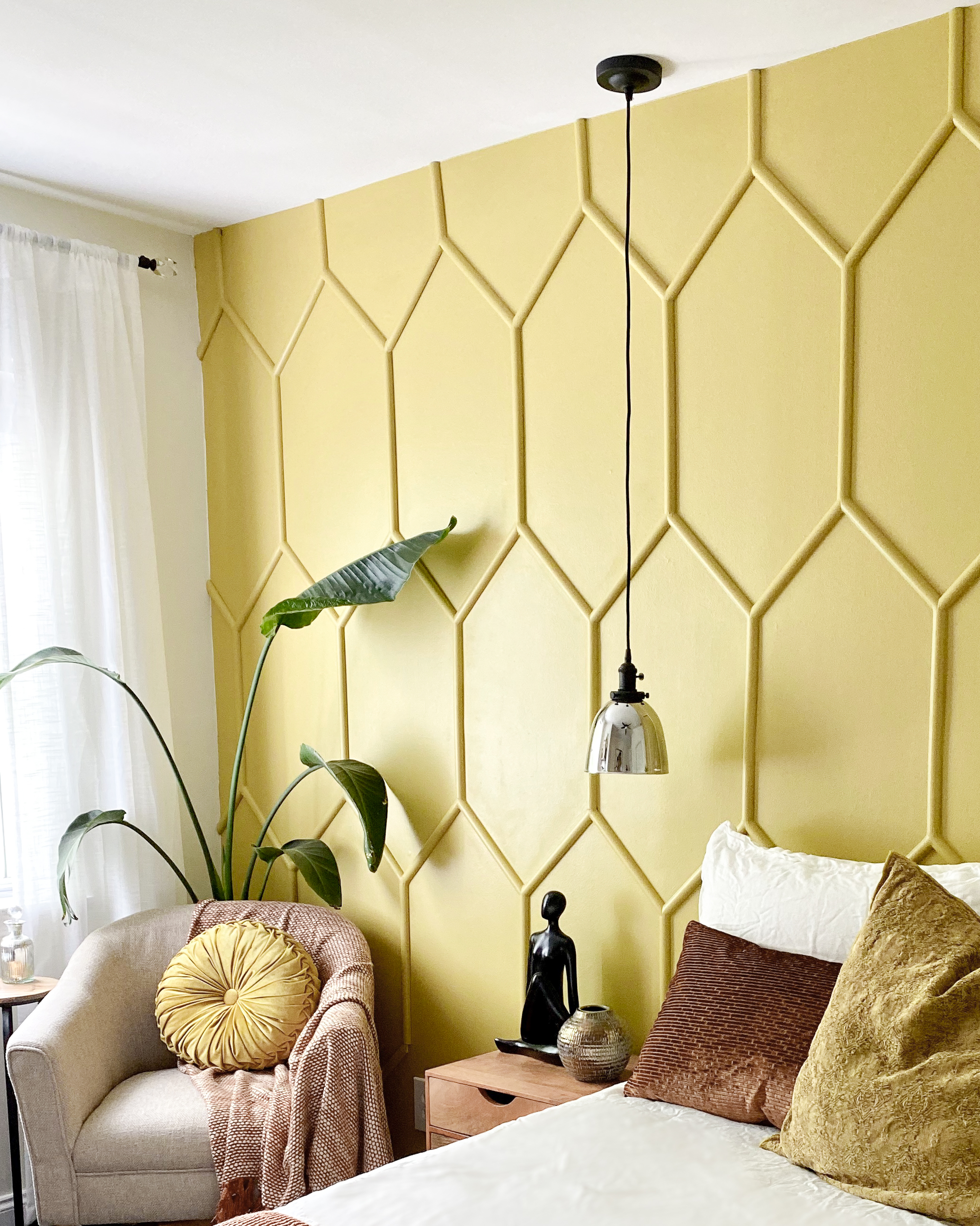
The corner chair and bench are both from Homepop Furniture – and I’m loving both peices! The chair is the perfect round / bucket shape that I needed to contrast the sharp angles of the wall, and the upholstery is this perfect earthy, neutral and natural texture and look that really softens things. It’s super comfy, too!
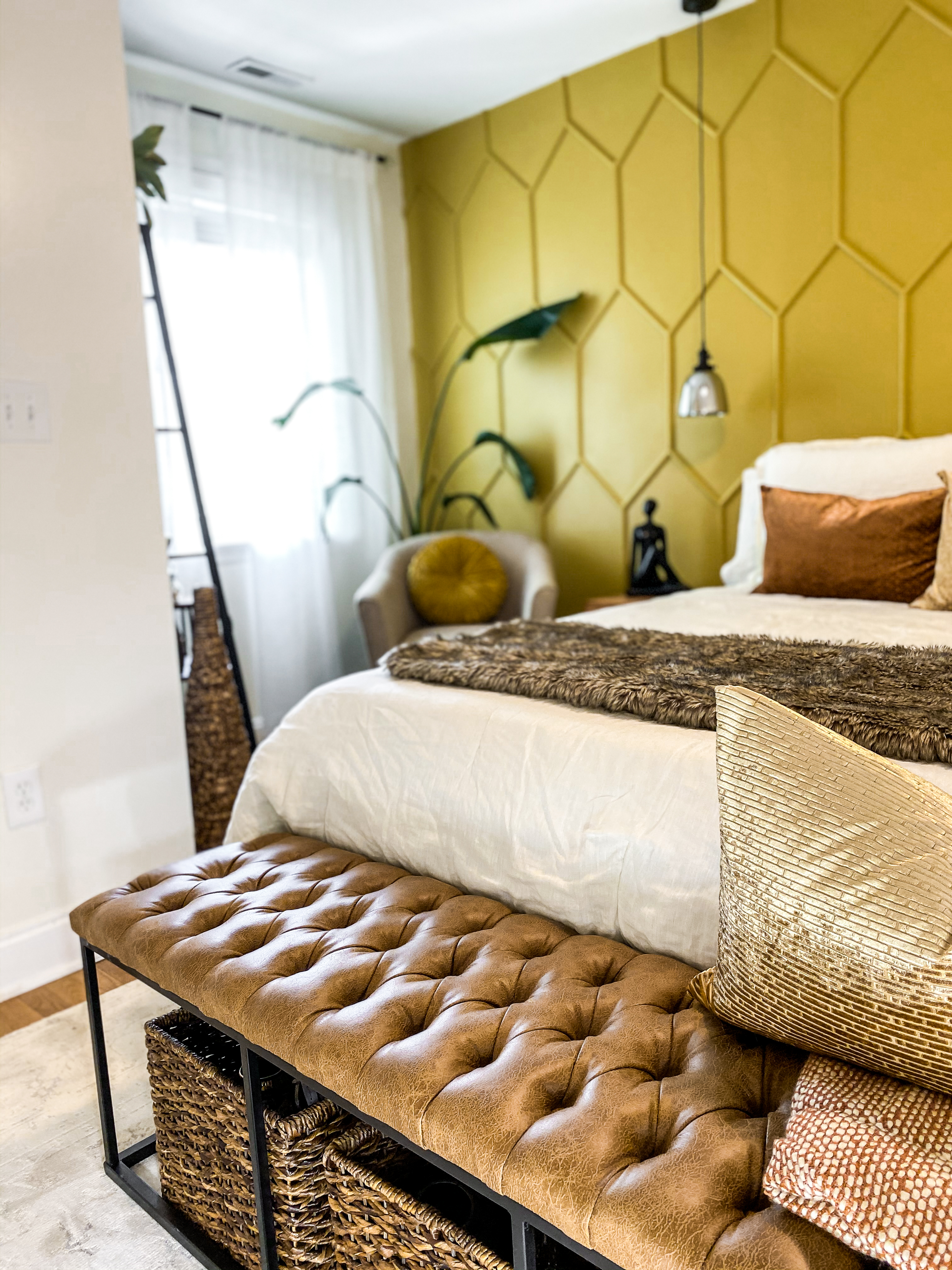
This bench at the foot of the bed another focal point in the room. As a vegan, I was really, really happy to find a great, high quality vegan leather bench! The faux leather is SO SOFT and just feels amazing. Even my husband remarked about how supple and buttery is felt. And, it has gorgeous distressed finish. The metal framing played perfectly off of the metal bed frame and metal ladder shelf, too! Then, I found these baskets at Target that could not have fit more perfectly under the bench and were the absolute perfect color!
The rug is the Mountainburg Area Rug from Boutique Rugs. I wanted a light colored, slightly aged looking rug that was super soft but without a super high pile. This rug really hits the nail on the head, and was great price, too!
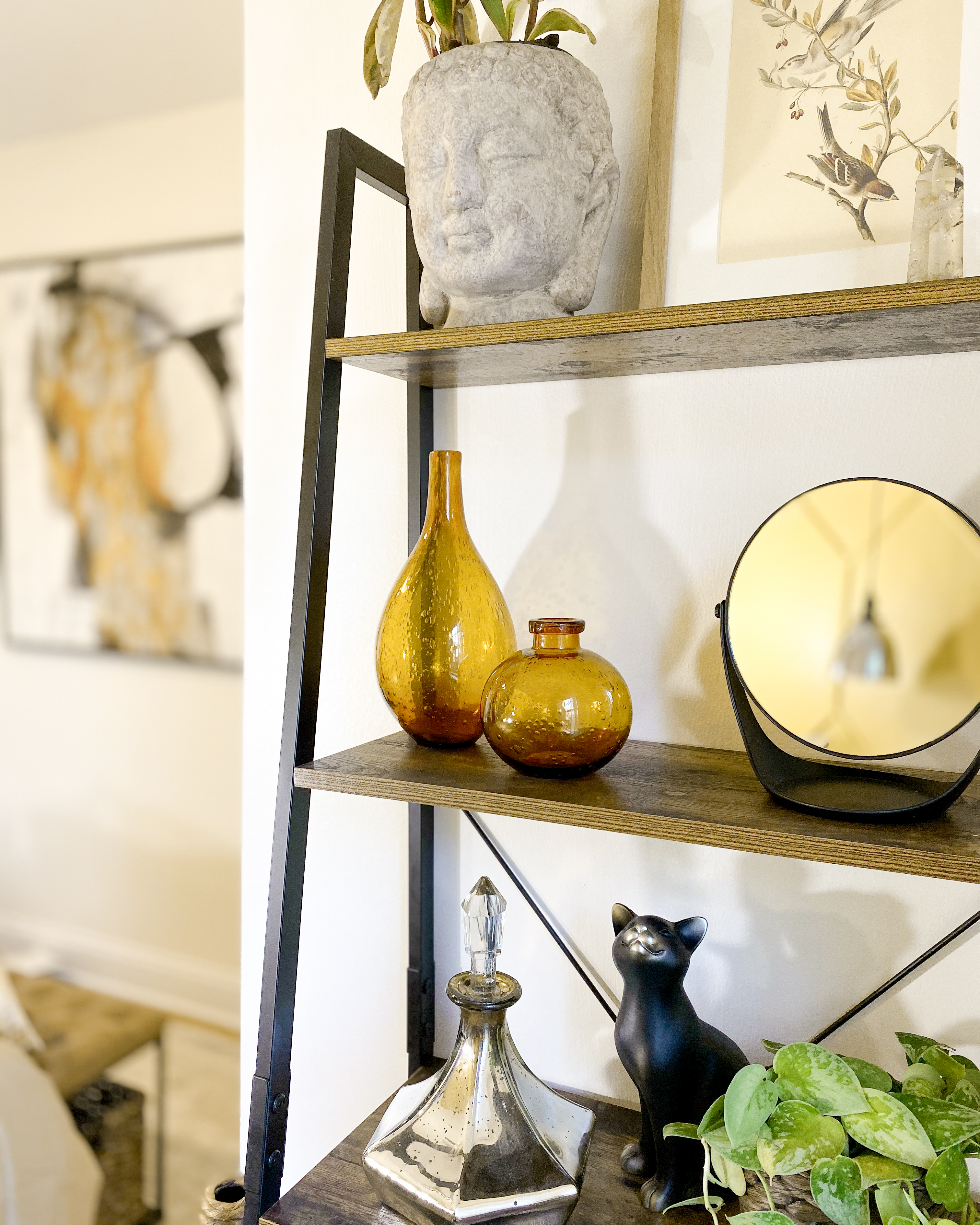
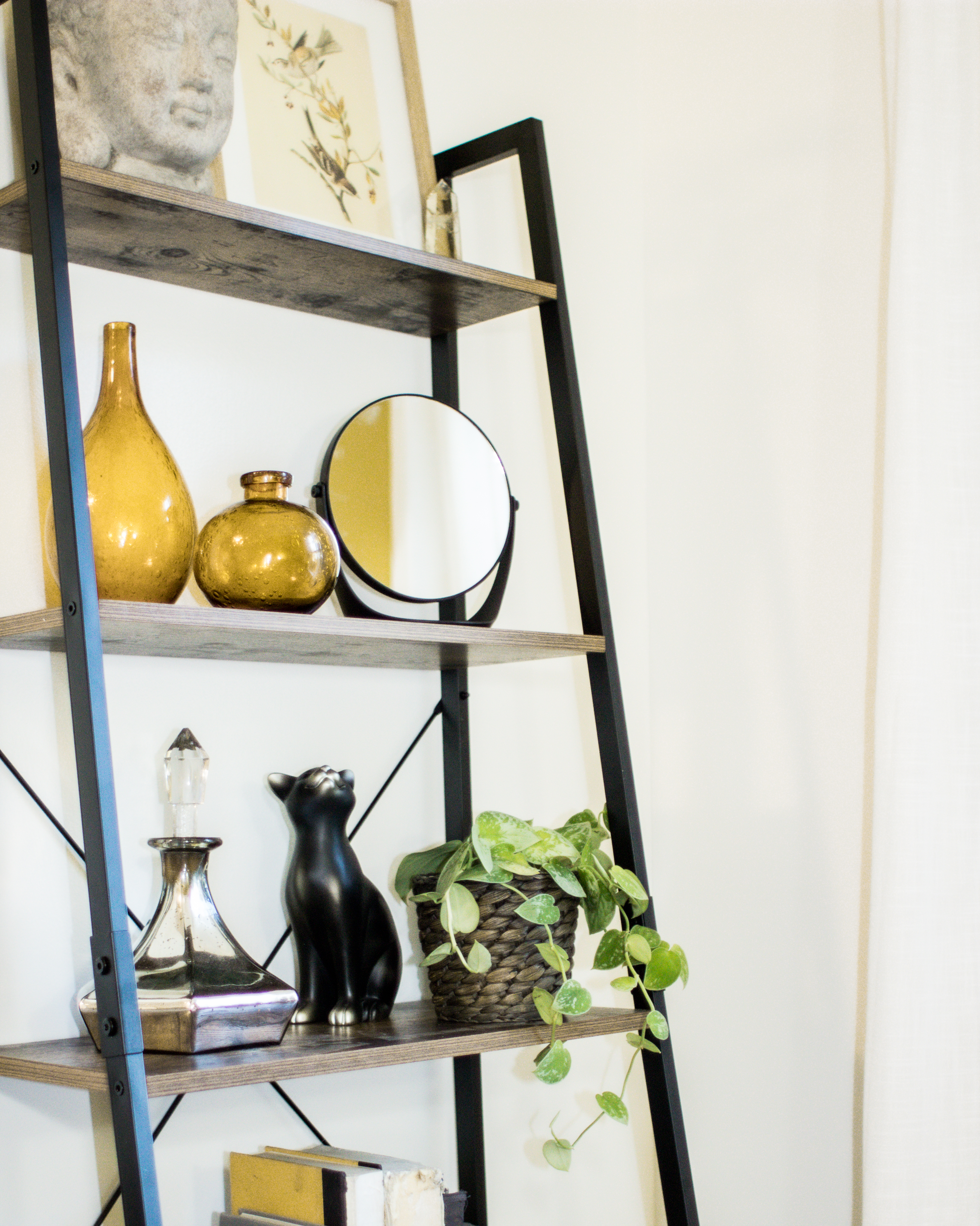
Finally, this alternate angle of the room – where I’ve got an airy, light-on-the-eyes ladder shelf and this large (4 ft by 4 ft!) peice of original art from HomeGoods – DID YOU GUYS KNOW THAT HOMEGOODS HAS ORIGINAL ART PEICES (at affordable prices)? This one is by a Native American woman named Coral in Canada and it make me so happy to know I was supporting an individaul more directly – even though I bought it at a bigger chain store, I still felt a connection with the artist!

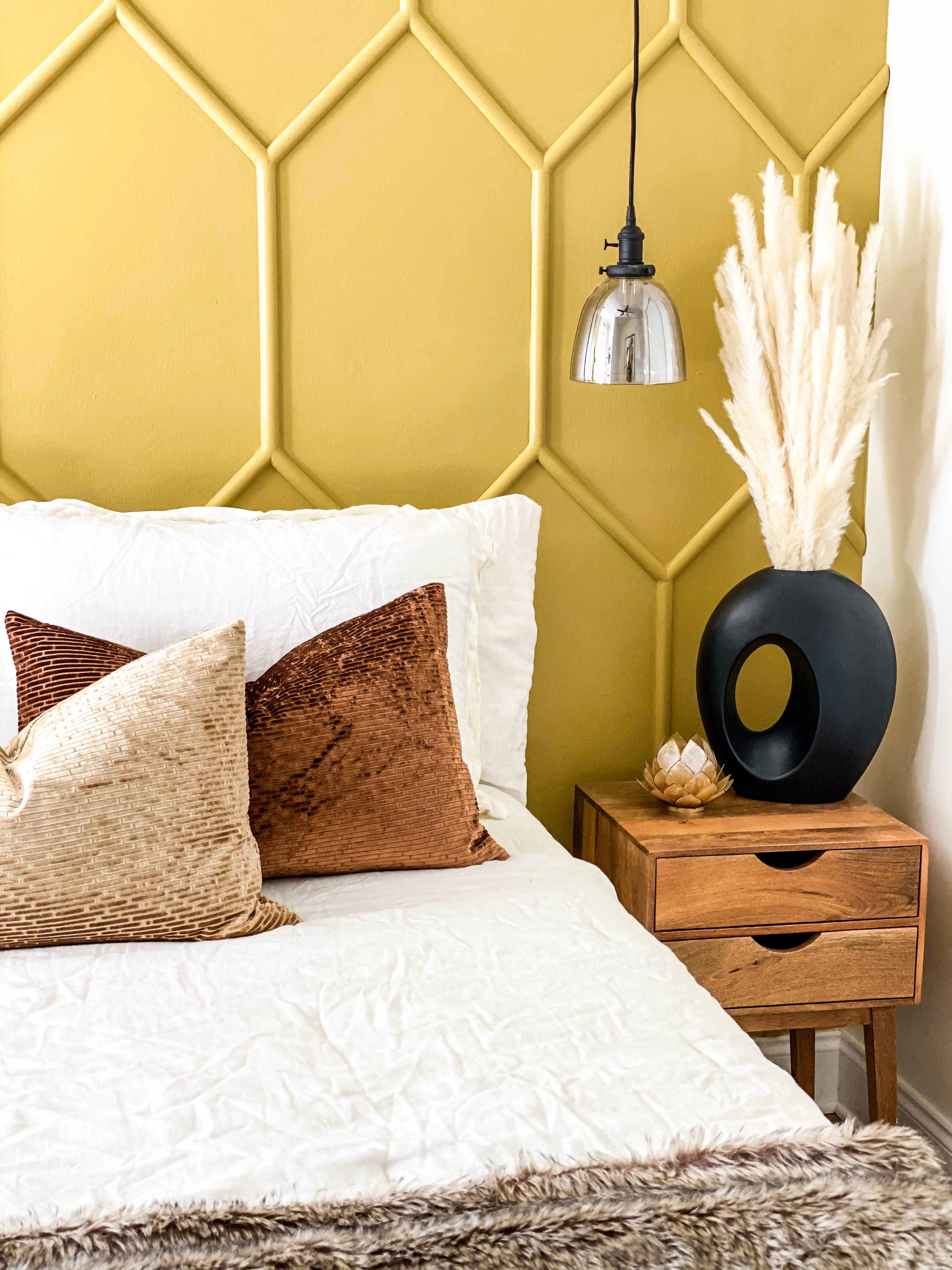

This wall treatment looks amazing, I love the honeycomb pattern. Such a great botanical touch.
Beautiful! I love the wall! It is stunning! And the mix and match of colors and texture is gorgeous! Congrats!
So pretty! I love the honeycomb wall!! Cheers to a great challenge!
that wall is everything! love the design and the color!
I really like “the Hive” accent wall in this space! So many great choices, good job!